Example of my work

Example of my work
Headland/ Hometown

Monday, 15 December 2014

Portrait - Rankin (John Rankin Waddell)

A photographer I've looked at again is Rankin, based in London, England. Ranking is from England and studied at London College of Printing. While studying there he met Jefferson Hack and after both of them graduating they started the magazine 'Dazed and Confused', now just known as 'Dazed'. Rankin is mainly a fashion and portrait photographer creating his works in the studio, while most of his work out of the two is focused on the fashion side of it. An example of his portrait work, as his portraiture work is most relevant to my current project, is this image below of Ian Brown. The background is something I expected as a plain white or black, sometimes grey, background are the most popular choices when shooting a portrait photograph. The black background in this image helps create this powerful photo as it blends in with Brown, as well as the fact the camera is further down than the actual subject's face angling itself looking up toward the subject, making him appear to be looking down on the viewer which adds to the feel of the photo. It looks as if to create the very dark image there was only one light used as is visible in his eyes, which appears to be a soft box.
The image of Ian Brown is found on the link below, the image belongs to Rankin.
http://www.fubiz.net/2010/03/17/rankin-portraits/
Something else which Rankin has done which I enjoyed watching was taking seven famous images from throughout the decades from other well known photographers and recreating them in his own way, giving his take on these iconic photographs throughout time and that have inspired many as well as Rankin himself. The images are all ones that paved the way for new thinking in photography and are timeless as they still make you feel the same after seeing them for the first time. They are the types of photographs you wish you had taken, they are original, different and most of all, like previously mentioned, inspiring to future generations of photographers, like Rankin.
The Seven Photographs that changed Fashion video link is below;
http://vimeo.com/60749359
An extensive selection of various styles and techniques in his portraits can be viewed on his website, just click on the link; http://rankin.co.uk/portraits/
A few examples of his portraiture work;
Jack O'Connell
 Daniel Craig
 Jessie J

 Andy Serkis
 Scarlett Johnasson
 Eva Green

Monday, 8 December 2014

Portrait - Initial ideas

My initial idea(s) for this project at first were blank as I was unsure with how to go about it. Once I knew I was going out for my first shoot of the project I had an idea and thought that I would like to keep it quite simple. However when I got out and started shooting once I chose where to go and what to have for my backdrop I positioned the camera and found the place where I needed people to stand, I took it from there. The photos I took are all full body length. My idea(s) quite vague but I think will work and fit as a body of work quite well. The three black and whites together, the black and white 20x24 exhibition piece and the six colour images. I think I will do both full body shots and full length and have various backgrounds. 

Portrait - Daragh McDonagh

This next photographer Daragh McDonagh I found on the British Journal of Photography website. After living in Manhattan, New York for a number of years as a professional photographer he decided to move back to his home land after feeling disconnected from the fast pace of the city and chose to photograph the Modern Shamans of Ireland after searching them online and feeling comfortable with both groups. He met up with them for a few months before taking a camera out which helped build a relationship with the subjects as well as trust amongst everyone and also the fact that he had a genuine personal interest with the subject itself. He shot on location for these images and used no backdrop and only natural northern light as he wanted to keep it simple and less intimidating for his subjects. It has the story on the website link below where the images are also found here -  http://www.bjp-online.com/2014/11/daragh-mcdonagh-the-modern-pagan/
An example of one of his images. I think one of his best from the series and actually my favourite. It's a great image, in my opinion. It is very central and is slightly over exposed but which he addresses and justifies. The look of thought on the woman's face is a great capture and creates and makes this quite a powerful image with meaning. You end up wondering about the woman and her life. I think it is also a good backdrop considering being on location, it looks like it could be a wall of a building very easily. The image is light and pale and the only real vibrant colour that stands out is the woman's top, her hair matches effortlessly with the backdrop, it almost blends right in.
All images belong to Daragh McDonagh

Portrait - Terry Richardson

The first portrait photographer I've chosen to look at is Terry Richardson who is from the USA and born in 1965. He has shot for labels such as Tom Ford, Marc Jacobs and Yves Saint Laurent and shot for magazines such as Vogue, Vanity Fair, GQ and Rolling Stone. His portraits of both models and high-profile celebrities are recognisable because of his use of bright white backgrounds, though now some slightly grey as he expanded into different backgrounds and also, in most images, the use of overexposure creating very light and white photos, he accomplishes this by using an attached flash on his camera. He shoots in both black and white and colour and shoots mostly in his studio.
A good example of his black and white overexposure is the images below of the English model Cara Delevingne. She almost blurs into the background, you can only just see her right (view from our left) shoulder which blends into the background, both being white coloured. Although this image, like his other bright, white overexposed images are visible and are very white you are still able to see the visible areas such as the darker areas where there is tone to see. For example you can see the darker zones in her hair, eyebrows, eyeliner and shadows in the first image and actually second image which are very similar, if not nye on the same. The second image is the same sort of style and has more shadows around the shoulders making it stand out a little bit more than the first image as it helps define itself from the background than in the first photo. In the third image of Cara you can see her wearing Richardson's glasses, which is expected in at least one of his shots with her as it is common and well know of him to always pose with the models, as well as the models posing on their own with his glasses, who swap attire and wear his glasses and sometimes his shirt, in return he sometimes wears something of theirs, for example, their glasses and/or headwear. Also in the third photo of Cara you can see that the background is now slightly darker and giving off a more grey tone which he seems to have done deliberately to match the darkness on Cara ( her black jumper and Richardson's black glasses) compared with the previous two images. Also all of these three images are light hearted and seen as fun as she is pulling a face in the 1st one, smiling with a thumbs up in the second and finally posing with his glasses and a slight different face in the third. These are also recognisable of Richardson as he is known to include humour within his images. The hat worn 'High Brow' is a joke on Cara's eyebrows as that is what she is famous and known for in the fashion industry, her thick brows which weren't as in fashion until she started her modelling career and made it fashionable.
Image above found on the link as well as many others of Cara by Terry Richardson. http://thesharper.blogspot.co.uk/2013/05/cara-delevingne-by-terry-richardson-may.html
Images of Cara Delevingne all belong to Terry Richardson and found between the two links to the sites below;
http://eclectic-society.com/it-girl-101-model-of-the-moment-cara-delevingne/
http://www.czytajniepytaj.pl/fashion/modelki/cara-delevingne-by-terry-richardson-october-2013-1954.html
An example of some of his images he uses without the bright white background and overexposure is also one in colour. This image is of lil' Wayne and the background may look white but in comparison to his other photos you are able to notice that it is slightly off shade and leaning more towards a light grey colour. He has decided to shoot lil' Wayne without a top on making his tattoos visible to the viewer, also his shades on top of his head and the chains around his neck, all of which he is known for. All of these portraying a certain image of him combined. The cigarette a simple prop for the image but has created a focus point in the centre with the smoke shape and could actually be argued that although a prop, for this portrait, is a main point in the photograph as the image itself is cropped from just below the shoulders and he is positioned just off from the centre, making your eyes look at all these things mentioned.
Image of Lil Wayne belongs to Terry Richardson and found on the link below;
http://www.lamjc.com/lil-wayne-gq-interview-terry
The image above of Gisele Bundchen belongs to Terry Richardson and found on the link below;
http://www.vibevixen.com/2013/09/20-favorite-terry-richardson-celebrity-portraits/10/
I have added both Gisele and Beyonce to further demonstrate Terry's subjects posing with his glasses, looking straight at/ into the camera (Gisele) and also including humour by pulling faces (Beyonce) and also the grey backgrounds which he started using instead of bright white all the time.
Beyonce image belonging to Terry Richardson and found on the site, link below.
http://www.kaylinfitzpatrick.com/2013/08/terry-richardsonphotographer.html
Here he has photographed the Current President of the United States Barack Obama. The first image has the least bright white background. It is cropped just below the shoulders like the lil Wayne picture but Obama is more central in this image and is further back, hence more space above the head and not as high up on the crop on the shoulders either. In all these image he is shown with smart attire which is representative of his job however in this first he has his shirt and tie on but with the tie a little loose and with the top button undone and portraying what appears to be a natural, genuine smile. All of this symbolising a relaxed approach compared with his everyday work, it shows him 'taking a break' from Presidential duties briefly. The second image is very much the same with him relaxed and smiling however this one has a more serious look as his top button is fastened, his suit jacket on and arms folded, portraying, still a relaxed look but one which appears to be more reliable and looks the part of being a President as he is smartly dressed for the role. The third image has a much more serious look to it simply because of Obama's facial expression, although his attire is more relaxed like in the first image . In regards to the other pictures shown it is the only one without him smiling yet could possibly be the most powerful. The last image is one of the typical poses that Richardson takes with all his subjects, a thumbs up and a handshake.
Site where I got the Barack Obama images below and photos belong to Terry Richardson.
http://www.whudat.de/barack-obama-by-terry-richardson-6-pictures/

Thursday, 27 November 2014

Portrait - Costing and Organisation

Organisation wise I have tried to roughly organise as best I can of what I think would be the best order to post my various blog posts on my portrait project. I have tried to work it out of doing general research first but still relevant to the project portraits then go into more focus posts of photographers and then also still posting within this what I'm doing at Uni in regards to taking images, what works what doesn't, printing and so on.
Costing for this project is quite high, probably one of the highest we've had if not the most. Although sending images off to be professionally printed can easily mount up the cost and for this assignment we do print out our own, it still works out expensive because of the costing of the paper and film a little.
£40 for 10 sheets of (black and white) paper sized 20 x 24
£10 for 10 sheets of (black and white) paper sized 9.5 x 12
£45 for 50 sheets of colour paper sized 12 x 16
£2 a black and white film which is one picture and I think it is around £5.50 for a roll of 12 pictures on a colour film.
£3 for the 20 x 24 sleeve. (bought individually.)
£9.95 for 9.5 x 12 print sleeves  (10 pack)
£13.45 for a 12 x 16 print sleeves (10 pack) 
Delivery came to £5.94
V.A.T came to £15.38 - as I ordered for 4 of us, all the same, 4  12x16 and 4 9.5x12. Individually it comes to nearly £5 V.A.T for just one each of those orders.

Monday, 24 November 2014

Portrait Photography Level 5

For my second project in second year we have portraits again however the difference this time is that we aren't shooting in the studio but out on the streets shooting strangers and using for some of these shots the 5x4 camera that I used in the last project for landscapes. For this project we have to hand in 3  9.5x12 inch black and white prints, 1  20x24 inch black and white also - exhibition standard print and finally 6  12x16 inch colour prints, the most we've had to hand in as a minimum. I will follow this post with some quite vague research on certain photographers, all who have done and/or focus on and are well known for their portraits as well as trying to find some lesser known photographers. I will then hopefully go into portraits and steer a little away from just talking about photographers however will mention them in the discussion if required. I will then mention costings and post things as they happen and things that are relevant, continuing on with my research as well.  

Friday, 7 November 2014

Editorial Evaluation

Editorial Evaluation.
Theme Extraordinary.
Nicola Callaghan (794 words)

I completed the assignment by first researching editorial and also the theme given which was extraordinary. I began looking at magazines like ‘Hot and Cool’ and photographers in general. After the initial research of these I began to think of ideas that I could do and one that came up which I liked was ‘Bipolar’. I have a friend who is Bipolar and she liked the idea as it brings awareness and she was willing to be photographed for the series which we had thought out and planned of how and what to do. A technique I used in some of the photos is one of my favourites which is Rembrandt lighting but which can also be tricky to get right. The method I chose was to shoot the series all in the studio as this would help me achieve them all looking like a body of work. I’m not too sure if anything or anyone in particular has inspired me to do the idea of Bipolar but I liked the fact it could help bring awareness and therefore people/ photographers who have done projects like this where they have made a series showing or portraying something to help bring awareness has inspired me. A problem I had at the beginning was trying to come up with an idea for this brief. I could think of things for editorial that I could possibly try and go in to but the word ‘extraordinary’ through me a bit and I was unsure what to do. I struggled coming up with something for about three weeks that I thought would fit both editorial and extraordinary. I had thought of maybe doing about Bipolar earlier on but only fully decided and committed to it within the third week. As it had been a few month since our last project I had forgotten how to do the sizing on the imaging for the CD, I had a vague idea but was uncertain so I looked up videos to try and help which they did somewhat but I have always had a little struggle with sizing, as even when I think it is right something always seems to be off or wrong. It takes a while for my head to get around things so I'm sure over time and practice I will be able to overcome this. The assignment challenged me because, like before in previous briefs, there is always something that I have not done formerly. In this case I had never done editorial or anything to do with the theme extraordinary, so I had to think of how to achieve what the brief asked of me. New skills I learned and have acquired because of this brief are editing skills, having to know what shots you want and choosing them all to fit together and work with each other to look like a body of work. Being able to go through a set of pictures and picking ones that fit the idea/ theme which all have a similar look and style to them but have their own individuality in regards to something in the image. I responded well from tutors and peers in regards to their feedback and advice as well as guidance. I really appreciated their comments and suggestions of how I could do certain things and also what I could do with the theme. I think that I have tried to meet the requirements of the brief as best I could and hopefully I have considering it was my first time doing anything editorial. As for the other requirements to the brief, i.e. the research (blog), prints, portfolio etc. I do think I have done what has been asked and is required though not all may be right or perfect. I would say that my work has been quite successful as I have done what is asked to the best of my ability. I could improve the work by trying even harder in the shoots I did in the studio to produce better work. I would also give myself more time to do the shoots and try to think of what I can do for the brief a lot sooner and this will help me have more time to take pictures where I know what I want to get out of the shoot and what my goals are to get out of studio time. What I would of done differently is similar to the above but also when sending my pictures of even the I set the resolution to 96 it came up low resolution, I think about 46, and I’m not sure why so had I more time I would have tried to correct this before sending them off. Hopefully they won’t be too bad!

Editorial Final Prints

Here are my final prints. A minimum of five are needed but I'm unsure of which ones to hand in as some are pretty much the same except for cropping and slight facial differences but I quite liked this as I, personally, think it fits the idea of Bipolar quite well.


Thursday, 6 November 2014

Editorial - Research Portraiture recreations

Famous photographer Rankin recreated 7 famous and iconic photographs that changed fashion. I have watched this twice and it is really interesting and good to watch.
http://www.telegraph.co.uk/culture/4161221/Rankin-Seven-Photographs-that-Changed-Fashion.html
Video to watch Rankin recreating the photographs, good watch, very interesting. Link here -.http://vimeo.com/60749359

A more recent version of recreations is photographer Sandro Miller, like Rankin, created more very famous and well known images however unlike Rankin he used only one model/ subject to do so and he was John Malkovich. The series is refreshing and done very well. One of the images he did was the well known Dorothea Lange photo entitled 'the migrant mother'.
http://www.boredpanda.com/portrait-remakes-malkovich-homage-to-photographic-masters-sandro-miller/

Editorial - Rene Burri

Another photographer I looked in to was Rene Burri who was Swiss. He is well known for his iconic images of huge historical and cultural and political events as well as important people of that time like Pablo Picasso and Che Guevara for example. A lot of his images, like Bailey's are black and white and because of this feels like it suited that time (era) as they wanted viewers to focus on the contents of the image not necessarily the colours. However although many of the works are taken around the same time they feel completely different because of the contents and differences of the pictures. The styles of the images are totally individual and only the black and white are what they have in common.
The link below will take you to some examples of his work from the Magnum site.
http://www.magnumphotos.com/C.aspx?VP3=CMS3&VF=MAGO31_10_VForm&ERID=24KL5350UE

Editorial - Research Photographers/ Portraits

One of the photographers I looked at is the very well known David Bailey. I chose him as I like his style of work regarding the harsh light that he sometimes uses and Rembrandt lighting. I like his black and white photographs that he still uses (does/produces) to this day and can easily recognise it as his work. You could only tell of the times (years) when the images where took because of the people in them as they are timeless.
Some of his work is available to see on Vogue if you click the link below;
http://www.vogue.co.uk/person/david-bailey
An interview Bailey did is the link below;
http://www.telegraph.co.uk/culture/art/art-features/10604874/David-Bailey-Ive-never-understood-why-people-like-Jean-Shrimpton-and-Kate-Moss-so-much.html

Another well known photographer I researched it Terry Richardson who, like Bailey, has photographed many celebrities and in his own very unique style and technique which is also recognisable. He has shot advertising campaigns for Tom Ford, Yves Saint Laurent, Marc Jacobs and supreme among many others.
 The link below is to Richardson's site;
http://www.terryrichardson.com/archive/#/


Editorial - Dazed magazine

Whilst researching I had a look at the magazine Dazed and Confused online. They have many various articles on there regarding fashion, art and culture, music and photography.
I think this magazine will be suitable and interesting for the majority of people as there is a great range within all of these subjects for people to chose from. They have some topical subject matters, up to date news given by photographers and journalists as well as artistic photographs.  
The link to have a look at this magazine also is below. All work belongs to the photographers credited. http://www.dazeddigital.com/

Monday, 3 November 2014

Editorial - Tutorial with teacher

I showed one of my lecturers in my tutorial the photos I'd taken so far and I told him my chosen subject of 'Bipolar' within the given brief Editorial and theme 'Extraordinary'. He mentioned not to do the 'cheesy' sort of images regarding to people screaming etc and showing the split emotion and focus more on the actual person and maybe have close ups so we get to really see the person and their emotion without them actually showing us directly. Looking at and in to their eyes to portray how they are feeling. I liked this idea, as well as my own still, but obviously opted to do what the lecturer said as it was his feedback and what would be the point of going to receive feedback to help you with your work and then not listening? He also stated to use a minimum of five different people instead of just the one person as it could/ would get boring seeing the same person for all five images, even if they were various images. So I have chosen to shoot five different people and each separate to the last,  I have ideas for four but two may be quite similar to each other more if I can't think of a fifth. 

Editorial - First shoot (ideas shoot), examples.

Here are some examples of a few idea shots I took for the given theme Extraordinary and my chosen subject Bipolar. The first images demonstrates the two sides we tried to portray. One side being normal, and the other how the person actually feels, maybe perceived as crazier to other people. Each side dressed differently to try and help visually demonstrate this idea. The second image I quite like but not sure why. The idea from this shot was previously I had taken shots of her foo above the clock to demonstrate her about to smash the clock and after those images I asked her to simply stand next to the clock and came up with this image. The third and fourth photographs link together as we played around with the idea of using shadows, as I had used shadows in I think all of the images so far, as it was another, subtle, concept of the shadow representing another side to the individual, a shadow that everyone has at some point. The first of these two images the model is in the picture and you can see she is creating the shadow and is aware of it, also whilst she is still dressed in a split way.  The bottom image solely shows just the shadow as I thought this brings the viewer in to think about what it could represent, what it is and the meaning of it. 


Wednesday, 29 October 2014

Editorial - Shoot beginnings/ progress

Here are a few images of my work in progress. The first image is an example of me uploading my photo(s) on photoshop. The second image is of the equipment I had during that shoot which was a Canon 6D, (which I used for the first time) and the lighting which I didn't have anything like 'Barndoors' which I'd asked for, as at the time I was unsure of what lighting I wanted and just picked those because I like them from previous use and they were easy to use however they had forgotten to be placed in with the kit so I was just left with the light as it was which was just a bulb The third photo demonstrates this. The fourth images shows the rest of the studio two that I was using and the final image is an  example of me trying to get lighting right and also of one of the shots we had an idea of/.


Saturday, 25 October 2014

Editorial - Bipolar Disorder

I have done some research around bipolar and it is probably best explained here by the NHS.
Bipolar disorder, formerly known as manic depression, is a condition that affects your moods, which can swing from one extreme to another.
If you have bipolar disorder, you will have periods or episodes of:
  • depression  where you feel very low and lethargic
  • mania  where you feel very high and overactive (less severe mania is known as hypomania)
Symptoms of bipolar disorder depend on which mood you are experiencing. Unlike simple mood swings, each extreme episode of bipolar disorder can last for several weeks (or even longer), and some people may not experience a "normal" mood very often.
To read more on the subject it goes further, just click the link below. 

Editorial Idea Research- Mental Health - Bipolar

I chose to go with the idea Bipolar and will take images regarding this. They will try and represent bipolar through a simple but, hopefully, effective portrait.
Some research I found were people had taken images inspired by Bipolar, the links are found below and is the artists work not mine.
An image I found which demonstrates the variations people may feel. The link and image found below. All rights belong to Sam Wrigglesworth.
https://www.flickr.com/photos/sam-wrigglesworth/6967364027/
Another example I found was this titled 'Torn Apart.'
http://brokenlightcollective.wordpress.com/2013/01/14/torn-apart/

Friday, 17 October 2014

Editorial Project (theme Extraordinary) - Ideas

With this project, initially I did struggle for almost three weeks with what I could actually do in reference to the theme that was set.  I could think of potential things in regards to 'Editorial' as I could imagine what I thought of as an article which helped me visualise and come up with picture ideas. However this theme 'extraordinary' within the project through me a bit as it was hard to conjure up an idea that would fit, or what I thought would fit as well as the teachers agreeing, the theme. My friend offered to help me brain-storm for ideas and I thought it would be a good idea to get a fresh opinion on it. I had thought of using her in my pictures, as I had used her before. (worked with her for a previous project).
One of my thoughts, one of the only ideas I had, was photographing people with Bipolar disorder, as I have two friends who are. One including my friend who helped me brain - storm. She liked the idea as it helped bring awareness and with the images we thought of taking shows the difference between Bipolar and Schizophrenic which a lot of people generally get wrong as they think they are the same but Bipolar Disorder is about changing emotions quickly and not being able to control it in the same way as most people and also hormones. Schizophrenic people have personality disorder, they have two or more completely different personalities and can alter between these. I thought of doing this because of people judging others for what they see but not them actually knowing the underlying problem. For example if you saw someone that seemed to be 'acting out' and 'over reacting' there may be a deeper meaning as to why. They could have kept it in for ages and then one simple thing has caused them to react to something we may not see as anything major. It helps show that just because it isn't a physical deformity we can see we shouldn't judge someone for something we know nothing about and which we can't see. It's these mental disabilities that people need to be aware of and to not judge someone they don't know. As I mentioned before I could see this as an article however the 'extraordinary' aspect I wasn't sure people would agree with but my argument to that would be people have to live with these conditions without strangers knowing their condition and so when they do act out they are getting judged for something they can't quite help and it is this, something most of us don't have to deal with for the rest of our lives, which I find quite extraordinary.
Some of the ideas we had to work with were representing both sides to her, one being the 'ordinary' side that everyone saw and the other potential side which is always there but which she suppresses and controls. For the shots we thought of doing her split emotions by having one side of seemingly 'normal', what people see and the other crazy and a representation of how she may actually feel but which she hides and keeps under wraps. Both of these would be shown on her at one time so we were trying to think of how to do this and we thought of having to types of makeup on each split down half of her face and the same for hairs and clothes. The other option we chose we could do was to have each side represented fully and photograph them separately.
Another thought we had was again to do with my friend. She has a couple medical disorders and due to this got told she will only live till she was 20. She is now 21 going on 22 shortly. However she always feels that death is still lurching and is always there, hovering over her. We came up with a few ways of portraying this. One was to have a clock, preferably a pocket watch, she could have with her that represents the time that she has and that it is a precious thing that she has got. We also thought of including 'death, the grim reaper' to help tell the story for people to understand. I thought of also the idea of balancing life and death, this would be represented by having something showing 'life' in one hand and the other showing 'death' in her other hand and she would be seen holding both and balancing them both. One other idea she had was to use a tunnel and this could represent the light at the end of the tunnel, which could be shot also with 'death' pulling her back towards the light and she is fighting going away from he light, fighting for her life. I chose this as well because it's something not a lot of us have to deal with and thought she was pretty extraordinary for keep going on through what she has. I have known her since about the age of three and she is a fighter, she has a secure job, a nice car and soon a house. She is still living her life, like she should, being positive, therefore I thought she is extraordinary.

“An interesting subject being uninteresting is uninteresting. An uninteresting subject being interesting is interesting. An interesting subject being interesting is very interesting.” Charlie Kirk

Friday, 3 October 2014

Editorial trip - Aaron Guy Talk- Newcastle

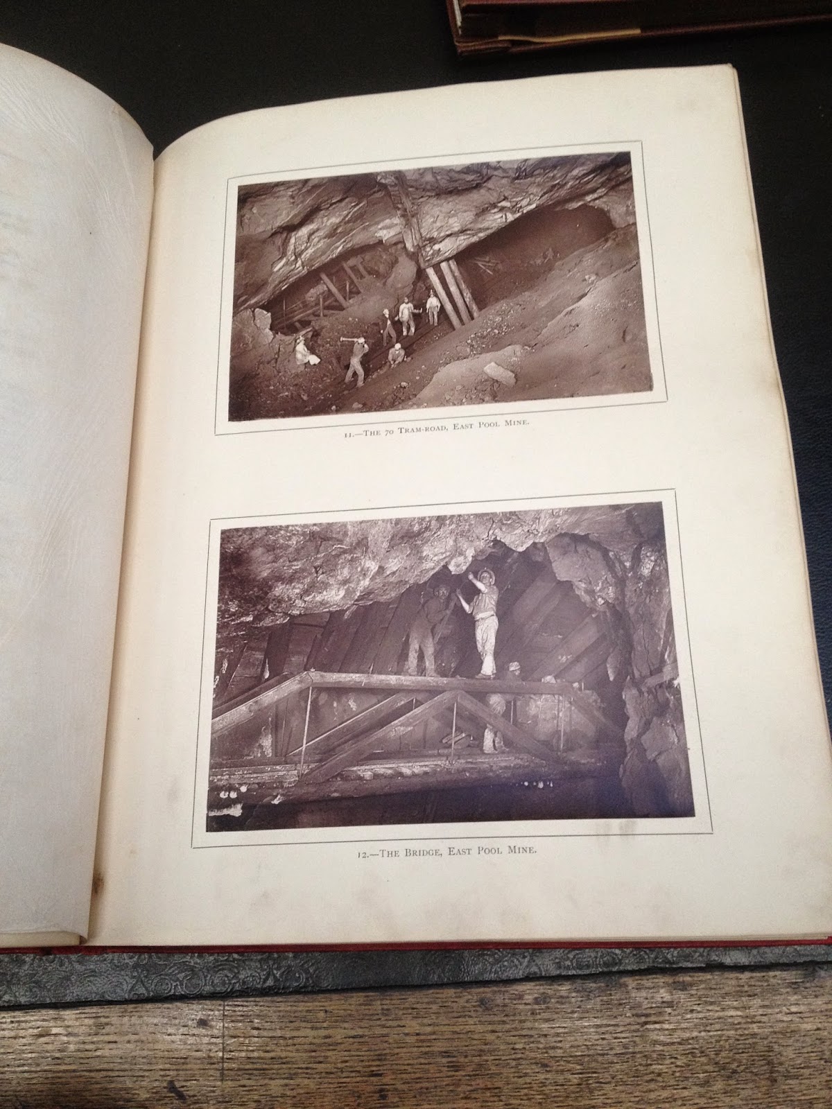
Yesterday I went with my class to Newcastle to have a talk from Aaron Guy who told us about his project photographing people who work in a mine and the landscape/ environment they work in as well as creating a film to coincide with it. He spoke of how this developed in to another 2 projects that all interlink with  each other and are a trilogy. After various people seeing his first project and liking what he was doing, which was his own thing, they commissioned him to do another two and got the money together for him to do so. During his talk he was able to show us parts of two of his videos and one which was about his latest project. After his talk we went to have a look around the library/ archive they have there which was amazing as some of the books were over a hundred years old.      


Tuesday, 30 September 2014

Editorial Research- Richard Whitehead

One of the first photographers I looked at for editorial research was Richard Whitehead. I quite like some of his portraits were he has the subject smiling at the camera as it looks natural and effortless, like he has made the subject comfortable and at ease with being photographed. They appear very relaxed and happy to be there. He uses both a white and black background within his images. In both the photos I have chosen, both subjects have a a prop with them that, to me, represents something about that person. The pipe in the first image is quite obvious in one sense as he could easily be a smoker and enjoys smoking a pipe or it could literally be a prop and nothing more. The second photo however the pencil, at first to me, may represent the fact that he may be an artist and therefore always has a pencil on him. It could mean he just had it on him like that and kept it for the photograph, it could have easily been a pencil. I like these photos because at first glance they seem simple and pretty straight forward and they are however they can also get you thinking a little bit more about them like I have briefly discussed.

Images all found on his website; Richard Whitehead website link
http://www.richwhitehead.com/p811412622

Friday, 26 September 2014

Editorial, Hot and Cool Magazine

For Editorial I first researched the magazine Hot and Cool which is an up and coming magazine that had started off by students who left Uni and began the magazine, each person bringing something different to the table as one had studied fashion, another photography and so on. They published the magazine and distributed it in a local book-shop and someone spotted it and asked to sponsor them which gave them more notice and other people then began asking to advertise in their magazine and therefore their magazine became more recognisable and notable. The magazine is quite different to most in their style and approach. They include various artists, from ceramics to older music and artists that maybe aren't as well known. Their style is unique.
The link to the magazine
http://hotandcool.biz/

Friday, 19 September 2014

2nd Year at Uni. New Brief, Editorial.

Went in to Uni yesterday to receive my timetable and find out my briefs etc. My first brief is Editorial, should be interesting. I will be researching the given Magazines to start with then branching out into more relatable work to what I choose to focus on as the theme is 'Extraordinary'. I'm not sure yet at all what I would like to do for this so hopefully the research will give me some ideas and I can work from there.

Wednesday, 28 May 2014

5 Final Prints


Evaluation

I completed the assignment by choosing to take photos of landscape but also incorporating, if not focusing more on the seascape side of it. To take these photos I used a field camera and 5 by 4 film. I used  a light meter to measure the light (ISO) of the areas where I was shooting and set the aperture accordingly on the camera. 
Some problems I had were getting used to the camera at first and also loading the 5 by 4 film in the dark and then also developing it all in complete darkness and without the clock working and on my own. Some of my images didn't work due to being exposed to light after taking the shot on the film so as a result I went out and retook my images on my own. I went out three times, the first two I took three photos each time, both of which I was with other students from my class and out of the six only one worked well, another only just, the rest (4) didn't work. On the third shoot where I retook them I shot another eight and this time only one didn't work, which I was very pleased with as I had took them by myself.
I could improve my work by taking more time in the dark room to print my images and therefore get a better result of them being printed. I am happy with the photos that I took. New skills I have learned are using the field camera and 5 by 4 film as I have never used these before. I have developed my ability in the dark room more and re-jogged my memory on using the equipment. I have responded well from advice and guidance from peers and tutors. I have took on board what they have said and answered with when I have asked them questions.
I consider my work to be a success and meet the requirements of the brief as I have completed everything given by the brief. I have took photos, done contact sheets, printed five photos, written a blog and everything else asked. I'm not too sure what has inspired and influenced me, if anything, I took photos of the landscape including the sea because I have took plenty of  shots like that before in my own time so I just did something I know and like and this is the reasoning and concept behind my work. 
The assignment brief challenged me because I had never used the field camera or the film before therefore I had to get used to using them, which I have now. Upon reflection I don't think I would do anything much different as I liked the photos I took however I would work more on getting the final prints improved slightly and trying to get them as good as I can get instead of being happy with how they are and leaving it. 

Landscape - Images/ Printing

The day after I printed my first picture I went out by myself and shot another 8 pictures of the same area as before, this brought the amount of pictures I had took up to 14 overall, including ones that didn't work. I was pleased with  the eight I had last took because after developing them I could see that only one hadn't worked, which was a big improvement. After I had developed them, rinsed and dried them I managed to get one final printed in the same day as I stayed back till about 9. On the following day I carried on printing in the dark room and was there the entire day because of this I was able to get the rest of my prints done, making the total up to five final prints.


This machine you can simply place your image(paper) through and it does everything for you, to even rinsing and drying as well as developing the image. This is a good time saver as you are able to get more done during the day.